Big tech is transforming every aspect of our world. But how, and at what cost? This season of Land of the Giants – The Disney Dilemma – focuses on Disney’s ability to weather the ups and downs of the business cycle and changing tastes and explores what has kept it successful for over 100 years. The entertainment giant has leveraged nostalgia and its intellectual property to build a beloved brand, but after an acquisition spree that included Marvel, Lucasfilm, and 20th Century Fox, can it sus ...
…
continue reading
Content provided by Paul Boag and Marcus Lillington. All podcast content including episodes, graphics, and podcast descriptions are uploaded and provided directly by Paul Boag and Marcus Lillington or their podcast platform partner. If you believe someone is using your copyrighted work without your permission, you can follow the process outlined here https://podcastplayer.com/legal.
Similar to Boagworld: UX, Design Leadership, Marketing & Conversion Optimization
Alessandro Bogliari, CEO and Co-Founder of The Influencer Marketing Factory, a global influencer marketing agency, talks with great guests about influencer marketing, social media, the creator economy, social commerce and much more.
…
continue reading
Some Goodness is hosted by Richard Ellis, a seasoned sales leader passionate about inviting top business minds to share their wisdom. Each episode is only 15-20 minutes, perfect for your commute or workout.
…
continue reading
The Village Global podcast takes you inside the world of venture capital and technology, featuring enlightening interviews with entrepreneurs, investors and tech industry leaders. Learn more at www.villageglobal.vc.
…
continue reading
Take a deep dive into the world of SEO and digital marketing with SE Ranking DoFollow Podcast. Actionable insights, latest trends, and thought-provoking case studies from seasoned experts and practitioners. In this SEO podcast, professionals and business leaders from all over the globe come together to help their less-experienced peers cut through the noise and catch them up on all the latest SEO advancements and developments.
…
continue reading
Profits Through Podcasting is your go-to resource for turning engaged listeners of your health-focused podcast into paying clients. Learn from health and wellness entrepreneurs who successfully employ a podcast as their main marketing tool, generating quality leads and growing their business. Whether you're a doctor, chiropractor, clinician, health business coach, therapist, or an entrepreneur in any other health or wellness related field, so long as you have a podcast, Profits Through Podca ...
…
continue reading
Pat Flynn from The Smart Passive Income Blog reveals all of his online business and blogging strategies, income sources and killer marketing tips and tricks so you can be ahead of the curve with your online business or blog. Discover how you can create multiple passive income streams that work for you so that you can have the time and freedom to do what you love, whether it's traveling the world, or just living comfortably at home. Since 2008, he's been supporting his family with his many on ...
…
continue reading
It didn’t all change in March 2020. Not really. The UK high street has been in the throes of a gradual revolution for decades. From the rise of ecommerce, to the birth of mobile, social commerce, and a growing emphasis on experience, change has been underway for a while. In fact for many, the pandemic has acted as a wake-up call. Digital transformation was no longer a ‘nice to have’ but a matter of survival. Necessity sparked innovation and customers are enjoying more flexibility and conveni ...
…
continue reading
The fun email marketing podcast. Sell more of your online courses, grow your membership and bring in more coaching clients with email marketing that doesn't stink. Sound good? Then join your fellow Email Marketing Heroes for your weekly dose of fun, practical, yet brutally honest email marketing advice. You can listen in to a piping hot, fresh episode every 'Email Marketing Wednesday' or if you prefer learning with your eyes instead of your ears, we turn each episode into a full written blog ...
…
continue reading
Publishing weekly since 2012, this show helps marketers navigate the ever changing marketing jungle with expert interviews from leading marketing pros. Join Social Media Examiner’s founder Michael Stelzner as he helps you discover new strategies and actionable tips to improve your marketing. Show notes at Socialmediaexaminer.com/podcast/
…
continue reading
Player FM - Podcast App
Go offline with the Player FM app!
Go offline with the Player FM app!

))
E-commerce UX Secrets: What 200,000 Hours of Research Reveals About Conversion
Manage episode 520057649 series 2548081
Content provided by Paul Boag and Marcus Lillington. All podcast content including episodes, graphics, and podcast descriptions are uploaded and provided directly by Paul Boag and Marcus Lillington or their podcast platform partner. If you believe someone is using your copyrighted work without your permission, you can follow the process outlined here https://podcastplayer.com/legal.
If you run an e-commerce site or work on digital products, this conversation is packed with research-backed insights that could transform your conversion rates.
Apps of the Week
Before we get into our main discussion, we want to highlight a couple of tools that caught our attention recently.
UX-Ray 2.0
We talked about this last week, but it deserves another mention. UX-Ray from Baymard Institute is an extraordinary tool built on 150,000 hours (soon to be 200,000 hours) of e-commerce research. You can scan your site or a competitor's URL, and it analyzes it against Baymard's research database, providing specific recommendations for improvement.
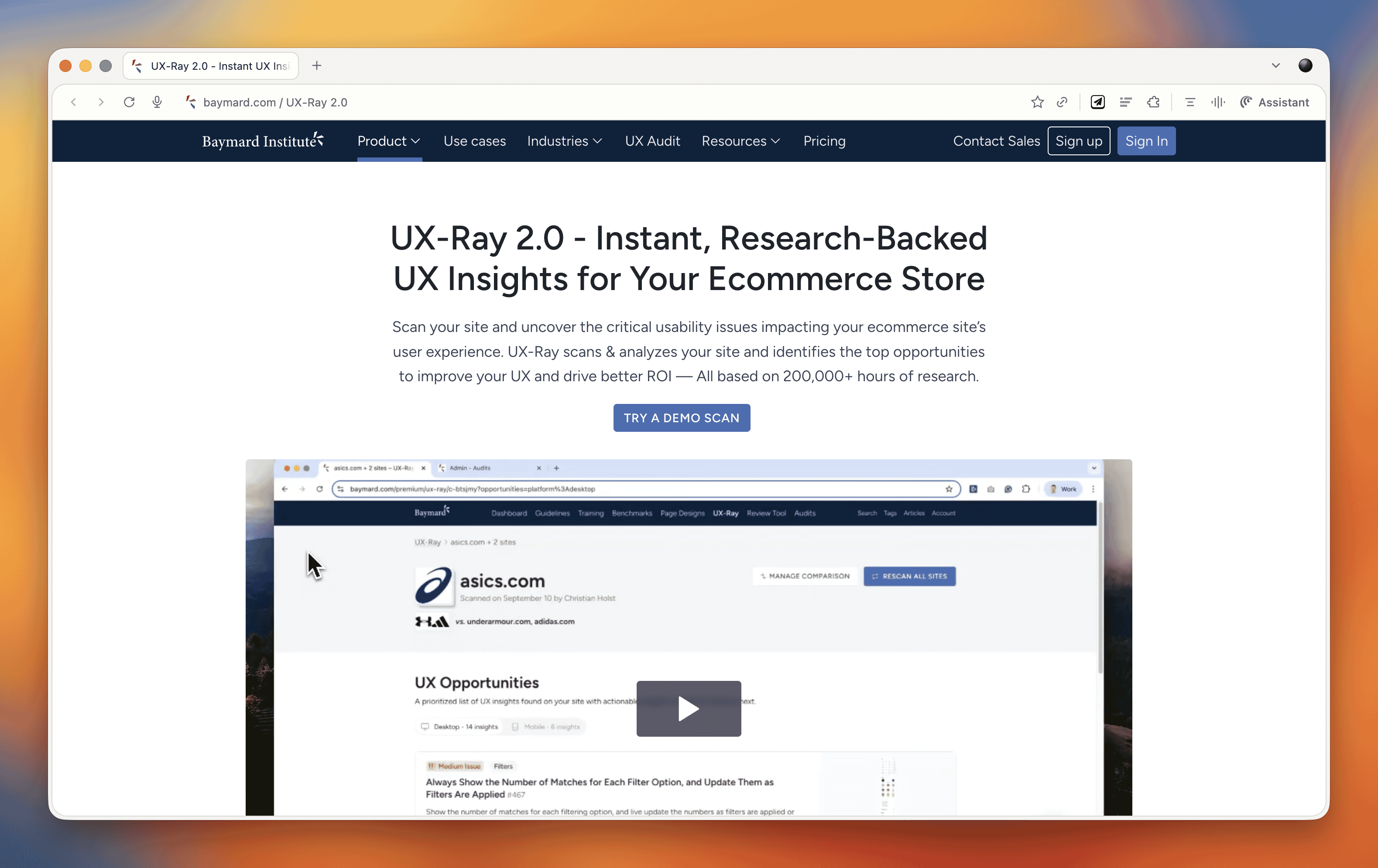
What makes UX-Ray remarkable is its accuracy. Baymard spent almost $100,000 just setting up a test structure with manually conducted UX audits of 50 different e-commerce sites across nearly 500 UX parameters. They then compared these line by line to how UX-Ray performed, achieving a 95% accuracy rate when compared to human experts. That accuracy is crucial because if a third of your recommendations are actually harmful to conversions, you end up wasting more time weeding those out than you saved.
Currently, UX-Ray assesses 40 different UX characteristics. They could assess 80 parameters if they dropped the accuracy to 70%, but they chose quality over quantity. Each recommendation links back to detailed guides explaining the research behind the suggestion.
For anyone working in e-commerce, particularly if you're trying to compete with larger players, this tool is worth exploring. There's also a free Baymard Figma plugin that lets you annotate your designs with research-backed insights, which is brilliant for justifying design decisions to stakeholders.
Snap
We also came across Snap this week, which offers AI-driven nonfacilitated testing. The tool claims to use AI personas that go around your site completing tasks and speaking out loud, mimicking user behavior.

These kinds of tools do our heads in a bit. On one hand, we're incredibly nervous about them because they could just be making things up. There's also the concern that they remove us from interacting with real users, and you don't build empathy with an AI persona the way you do with real people. But on the other hand, the pragmatic part of us recognizes that many organizations never get to do testing because management always says there's no time or money. Tools like this might enable people who would otherwise never test at all.
At the end of the day, it comes down to accuracy and methodology. Before using any such tool, you should ask them to document their accuracy rate and show you that documentation. That will tell you how much salt to take their output with.
E-commerce UX Best Practices with Christian Holst
Our main conversation this month is with Christian Holst, Research Director and Co-Founder of Baymard Institute. We've been following Baymard's work for years, and having Christian on the show gave us a chance to dig into what nearly 200,000 hours of e-commerce research has taught them about conversion optimization.
The Birth of Baymard Institute
Christian shared the story of how Baymard started about 15 years ago. His co-founder Jamie was working as a lead front-end developer at a medium-sized agency, and he noticed something frustrating about design decision meetings. When the agency prepared three different design variations, the decision often came down to who could argue most passionately (usually the designer who created that version), the boss getting impatient and just picking one, or the client simply choosing their favorite.
Rarely did anyone say they had large-scale user experience data to prove which design would actually work better. They realized they could solve this problem by testing general user behavior across sites and looking for patterns that transcend individual websites. If they threw out the site-specific data and only looked for patterns across sites, they could uncover what are general user behaviors for specific UI components and patterns.
It started with just checkout flows. It wasn't even clear they would ever move beyond that. But now, 15 years later, Baymard has a team of around 60 people, with 35 working full-time on conducting new research or maintaining existing research.
The Role of Research-Backed Guidelines
One important point Christian emphasized is that Baymard's research isn't meant to replace your own internal testing. You should always do your own data collection and usability testing. The point of having a large database of user behavior and test-based best practices is that when you're redesigning something, you have maybe 100 micro decisions to make. You can't run internal tests for every single one of those decisions.
Even Fortune 500 companies that have the budget don't have the time to wait for results on every micro decision. So what happens is you collect research on the two or three big things that are site-specific or unique to your brand or customer demographic. But all the generic stuff (how to design an expand and collapse feature, how the quantity field should work, how the phone field should be designed in a checkout flow) these are extremely standardized UI components where users have standardized expectations.
You shouldn't squander your internal test resources on testing things that are completely generic. That's where pre-made research comes in. It removes 97 of the micro decisions so you can focus your resources on what's unique and important to your brand.
Common E-commerce Conversion Killers
We asked Christian what kills conversion the most on e-commerce sites. While it depends on each site's specific issues, there are some concrete things Baymard has consistently seen sites fail at that are surprisingly easy to fix.
The Order Review Trap
In countries where you have an order review step (where users review the whole order before pressing "place order"), there's a really dangerous trap. The order review step and the order confirmation step look very similar in users' minds. Both are textual pages that appear after entering credit card data. Both show a summary of information.
In testing, Baymard consistently sees some users misinterpret the order review step for a confirmation step. This is a critical error because these users will exit the page thinking they've completed their order. They don't even realize the abandonment occurred. It's the worst type of checkout abandonment that can happen.
A very simple trick is to take the "place order" button that you usually have at the bottom of the page and duplicate it so there's also one at the top of the page. One audit client did this and got a $10 million return on investment from just duplicating that button. It won't affect 10% of users, but if it prevents one out of 200 users from abandoning, that's half a percent of all your site revenue you've recovered.
Error Recovery Experience
Christian called this "the least sexy but most important topic" in checkout flows. The general error recovery experience in checkout flows has improved over the 15 years Baymard has been researching, but it's still way too poor.
When a validation error occurs, users struggle with three things:
- Understanding that an error actually happened
- Understanding where the error is
- Understanding how to resolve it
Best practices for error recovery:
- Provide visual styling for each field that's wrong
- Have a description at the top of the page that outlines all errors
- Use conditional logic: if there's only one error, scroll them to that field. If there are multiple errors, scroll to the top where they can see the overview
Baymard sees users who fix one error, resubmit, and then get frustrated when the page reloads with another error they didn't see. They sometimes conclude the page is broken. When Baymard surveys users, 6% say they've abandoned a checkout flow in the past quarter due to perceived technical errors. Most of these aren't actual technical errors, the page is just extremely complicated to use.
Adaptive Error Messages
Instead of saying "phone number is invalid," tell users exactly why. Your technical system knows exactly which validation rule was triggered. If the phone number is wrong because it includes a special character, tell them: "Special characters cannot be used. You don't need to include the country code." If it's too long or too short, say that specifically. This helps users recover faster.
Ideally, much of this should be fixed in the backend. Postcodes are a great example, some people put a space in UK postcodes, some don't. Some write it all uppercase, some use mixed case. Why isn't this fixed in the backend? There should be something tidying it up and dropping it into the database in the correct format.
Product Data and Imagery
One area where Baymard has seen genuine improvements is around product data and product imagery. Most sites took a long time to figure out that the content on the product details page is crucial to user experience.
When users land on a product details page, 90-95% of what they do as a first action is look at the image. But they also use images for tasks where it's a terrible idea. For instance, if trying to figure out whether a speaker has the right connection, instead of going to the specification sheet, they look for images showing the speaker from the back to see the connections. If they can't see it, they conclude it doesn't have the connection and abandon that product.
Users are extremely visually driven, even trying to use images to solve problems where it's a poor strategy. Sites need really good imagery from multiple angles, detailed videos showing what goes on visually, and proper product descriptions.
Building Trust in E-commerce
We asked Christian about building trust beyond the lazy approach of just shoving social proof and awards on the site. His insights were revealing:
Social Proof On and Off-Site
Social proof is important both on your page and off it. If people are in doubt whether to trust you, they won't trust your version of whether they should trust you. They'll go offsite to check reviews. Responding to negative reviews is crucial because it helps explain or set context. Users often seek out negative reviews more than positive ones to do due diligence. They understand not every product is perfect for every user, but they want to know if the shortcomings are relevant to them.
Return Policies and Professional Design
Clear and generous return policies help build trust. But there's also the "aesthetic usability effect", having a well-worked design without complications builds trust and credibility. Sites that look too dated will degrade trust. If something looks like it was made in the nineties, users may question if it's too unprofessional.
Simply having a site that's not too complicated to use also builds trust. If users get completely stuck, they may conclude it's too unprofessional or wonder if there's something wrong with the business.
These effects depend quite a bit on whether people know the brand. It changes dramatically if it's a large known brand versus a completely unknown small site with new users.
The Future: AI and E-commerce
We couldn't resist asking Christian about AI's impact on e-commerce. There are similarities to when voice applications came out five or six years ago. Everyone said we'd order everything with our voice, but that didn't really happen. This time may be different, but it won't go as fast as people think, at least not for all purchases.
There are some commodity items and household staples you just want restocked when they run out. Those are well suited for AI purchasing, the same type of products you'd buy on subscription today. But many purchases require users to be in control.
Where AI is already changing things massively is not in the complete purchase but in research and product discovery. Which digital camera should I buy? Which one is best for my requirements? This has always been an offsite experience. Users typically have multiple e-commerce sites, review sites, blogs, and social media open when researching purchases. That part is changing rapidly with AI.
But going from winnowing down millions of products to a few options, then having AI auto-purchase one of them, will take quite a while before users are that confident. It may even be generational, people our age may never fully trust it even when it becomes trustworthy, while the next generation growing up with competent AI will develop different habits.
Final Thoughts
What really strikes us about e-commerce optimization is how it's death by a thousand cuts. It's not that one of these things will wreck your conversion rate, but collectively they cause real problems. When you're dealing with an entire e-commerce site, there are so many little things that it's impossible to plan for all of them upfront. You will miss things.
That's why post-launch optimization is crucial. There will always be things that need improving, and that ongoing work can span years. It's a big job, but the research and tools that organizations like Baymard provide make it far more manageable than trying to figure everything out from scratch.
Marcus's Joke
And now, as always, Marcus leaves us with his joke of the week:
"My dad suggested I register for a donor card. He's a man after my own heart."
That's actually quite good, Marcus. We'll allow it.
569 episodes
E-commerce UX Secrets: What 200,000 Hours of Research Reveals About Conversion
Boagworld: UX, Design Leadership, Marketing & Conversion Optimization
Manage episode 520057649 series 2548081
Content provided by Paul Boag and Marcus Lillington. All podcast content including episodes, graphics, and podcast descriptions are uploaded and provided directly by Paul Boag and Marcus Lillington or their podcast platform partner. If you believe someone is using your copyrighted work without your permission, you can follow the process outlined here https://podcastplayer.com/legal.
If you run an e-commerce site or work on digital products, this conversation is packed with research-backed insights that could transform your conversion rates.
Apps of the Week
Before we get into our main discussion, we want to highlight a couple of tools that caught our attention recently.
UX-Ray 2.0
We talked about this last week, but it deserves another mention. UX-Ray from Baymard Institute is an extraordinary tool built on 150,000 hours (soon to be 200,000 hours) of e-commerce research. You can scan your site or a competitor's URL, and it analyzes it against Baymard's research database, providing specific recommendations for improvement.
What makes UX-Ray remarkable is its accuracy. Baymard spent almost $100,000 just setting up a test structure with manually conducted UX audits of 50 different e-commerce sites across nearly 500 UX parameters. They then compared these line by line to how UX-Ray performed, achieving a 95% accuracy rate when compared to human experts. That accuracy is crucial because if a third of your recommendations are actually harmful to conversions, you end up wasting more time weeding those out than you saved.
Currently, UX-Ray assesses 40 different UX characteristics. They could assess 80 parameters if they dropped the accuracy to 70%, but they chose quality over quantity. Each recommendation links back to detailed guides explaining the research behind the suggestion.
For anyone working in e-commerce, particularly if you're trying to compete with larger players, this tool is worth exploring. There's also a free Baymard Figma plugin that lets you annotate your designs with research-backed insights, which is brilliant for justifying design decisions to stakeholders.
Snap
We also came across Snap this week, which offers AI-driven nonfacilitated testing. The tool claims to use AI personas that go around your site completing tasks and speaking out loud, mimicking user behavior.
These kinds of tools do our heads in a bit. On one hand, we're incredibly nervous about them because they could just be making things up. There's also the concern that they remove us from interacting with real users, and you don't build empathy with an AI persona the way you do with real people. But on the other hand, the pragmatic part of us recognizes that many organizations never get to do testing because management always says there's no time or money. Tools like this might enable people who would otherwise never test at all.
At the end of the day, it comes down to accuracy and methodology. Before using any such tool, you should ask them to document their accuracy rate and show you that documentation. That will tell you how much salt to take their output with.
E-commerce UX Best Practices with Christian Holst
Our main conversation this month is with Christian Holst, Research Director and Co-Founder of Baymard Institute. We've been following Baymard's work for years, and having Christian on the show gave us a chance to dig into what nearly 200,000 hours of e-commerce research has taught them about conversion optimization.
The Birth of Baymard Institute
Christian shared the story of how Baymard started about 15 years ago. His co-founder Jamie was working as a lead front-end developer at a medium-sized agency, and he noticed something frustrating about design decision meetings. When the agency prepared three different design variations, the decision often came down to who could argue most passionately (usually the designer who created that version), the boss getting impatient and just picking one, or the client simply choosing their favorite.
Rarely did anyone say they had large-scale user experience data to prove which design would actually work better. They realized they could solve this problem by testing general user behavior across sites and looking for patterns that transcend individual websites. If they threw out the site-specific data and only looked for patterns across sites, they could uncover what are general user behaviors for specific UI components and patterns.
It started with just checkout flows. It wasn't even clear they would ever move beyond that. But now, 15 years later, Baymard has a team of around 60 people, with 35 working full-time on conducting new research or maintaining existing research.
The Role of Research-Backed Guidelines
One important point Christian emphasized is that Baymard's research isn't meant to replace your own internal testing. You should always do your own data collection and usability testing. The point of having a large database of user behavior and test-based best practices is that when you're redesigning something, you have maybe 100 micro decisions to make. You can't run internal tests for every single one of those decisions.
Even Fortune 500 companies that have the budget don't have the time to wait for results on every micro decision. So what happens is you collect research on the two or three big things that are site-specific or unique to your brand or customer demographic. But all the generic stuff (how to design an expand and collapse feature, how the quantity field should work, how the phone field should be designed in a checkout flow) these are extremely standardized UI components where users have standardized expectations.
You shouldn't squander your internal test resources on testing things that are completely generic. That's where pre-made research comes in. It removes 97 of the micro decisions so you can focus your resources on what's unique and important to your brand.
Common E-commerce Conversion Killers
We asked Christian what kills conversion the most on e-commerce sites. While it depends on each site's specific issues, there are some concrete things Baymard has consistently seen sites fail at that are surprisingly easy to fix.
The Order Review Trap
In countries where you have an order review step (where users review the whole order before pressing "place order"), there's a really dangerous trap. The order review step and the order confirmation step look very similar in users' minds. Both are textual pages that appear after entering credit card data. Both show a summary of information.
In testing, Baymard consistently sees some users misinterpret the order review step for a confirmation step. This is a critical error because these users will exit the page thinking they've completed their order. They don't even realize the abandonment occurred. It's the worst type of checkout abandonment that can happen.
A very simple trick is to take the "place order" button that you usually have at the bottom of the page and duplicate it so there's also one at the top of the page. One audit client did this and got a $10 million return on investment from just duplicating that button. It won't affect 10% of users, but if it prevents one out of 200 users from abandoning, that's half a percent of all your site revenue you've recovered.
Error Recovery Experience
Christian called this "the least sexy but most important topic" in checkout flows. The general error recovery experience in checkout flows has improved over the 15 years Baymard has been researching, but it's still way too poor.
When a validation error occurs, users struggle with three things:
- Understanding that an error actually happened
- Understanding where the error is
- Understanding how to resolve it
Best practices for error recovery:
- Provide visual styling for each field that's wrong
- Have a description at the top of the page that outlines all errors
- Use conditional logic: if there's only one error, scroll them to that field. If there are multiple errors, scroll to the top where they can see the overview
Baymard sees users who fix one error, resubmit, and then get frustrated when the page reloads with another error they didn't see. They sometimes conclude the page is broken. When Baymard surveys users, 6% say they've abandoned a checkout flow in the past quarter due to perceived technical errors. Most of these aren't actual technical errors, the page is just extremely complicated to use.
Adaptive Error Messages
Instead of saying "phone number is invalid," tell users exactly why. Your technical system knows exactly which validation rule was triggered. If the phone number is wrong because it includes a special character, tell them: "Special characters cannot be used. You don't need to include the country code." If it's too long or too short, say that specifically. This helps users recover faster.
Ideally, much of this should be fixed in the backend. Postcodes are a great example, some people put a space in UK postcodes, some don't. Some write it all uppercase, some use mixed case. Why isn't this fixed in the backend? There should be something tidying it up and dropping it into the database in the correct format.
Product Data and Imagery
One area where Baymard has seen genuine improvements is around product data and product imagery. Most sites took a long time to figure out that the content on the product details page is crucial to user experience.
When users land on a product details page, 90-95% of what they do as a first action is look at the image. But they also use images for tasks where it's a terrible idea. For instance, if trying to figure out whether a speaker has the right connection, instead of going to the specification sheet, they look for images showing the speaker from the back to see the connections. If they can't see it, they conclude it doesn't have the connection and abandon that product.
Users are extremely visually driven, even trying to use images to solve problems where it's a poor strategy. Sites need really good imagery from multiple angles, detailed videos showing what goes on visually, and proper product descriptions.
Building Trust in E-commerce
We asked Christian about building trust beyond the lazy approach of just shoving social proof and awards on the site. His insights were revealing:
Social Proof On and Off-Site
Social proof is important both on your page and off it. If people are in doubt whether to trust you, they won't trust your version of whether they should trust you. They'll go offsite to check reviews. Responding to negative reviews is crucial because it helps explain or set context. Users often seek out negative reviews more than positive ones to do due diligence. They understand not every product is perfect for every user, but they want to know if the shortcomings are relevant to them.
Return Policies and Professional Design
Clear and generous return policies help build trust. But there's also the "aesthetic usability effect", having a well-worked design without complications builds trust and credibility. Sites that look too dated will degrade trust. If something looks like it was made in the nineties, users may question if it's too unprofessional.
Simply having a site that's not too complicated to use also builds trust. If users get completely stuck, they may conclude it's too unprofessional or wonder if there's something wrong with the business.
These effects depend quite a bit on whether people know the brand. It changes dramatically if it's a large known brand versus a completely unknown small site with new users.
The Future: AI and E-commerce
We couldn't resist asking Christian about AI's impact on e-commerce. There are similarities to when voice applications came out five or six years ago. Everyone said we'd order everything with our voice, but that didn't really happen. This time may be different, but it won't go as fast as people think, at least not for all purchases.
There are some commodity items and household staples you just want restocked when they run out. Those are well suited for AI purchasing, the same type of products you'd buy on subscription today. But many purchases require users to be in control.
Where AI is already changing things massively is not in the complete purchase but in research and product discovery. Which digital camera should I buy? Which one is best for my requirements? This has always been an offsite experience. Users typically have multiple e-commerce sites, review sites, blogs, and social media open when researching purchases. That part is changing rapidly with AI.
But going from winnowing down millions of products to a few options, then having AI auto-purchase one of them, will take quite a while before users are that confident. It may even be generational, people our age may never fully trust it even when it becomes trustworthy, while the next generation growing up with competent AI will develop different habits.
Final Thoughts
What really strikes us about e-commerce optimization is how it's death by a thousand cuts. It's not that one of these things will wreck your conversion rate, but collectively they cause real problems. When you're dealing with an entire e-commerce site, there are so many little things that it's impossible to plan for all of them upfront. You will miss things.
That's why post-launch optimization is crucial. There will always be things that need improving, and that ongoing work can span years. It's a big job, but the research and tools that organizations like Baymard provide make it far more manageable than trying to figure everything out from scratch.
Marcus's Joke
And now, as always, Marcus leaves us with his joke of the week:
"My dad suggested I register for a donor card. He's a man after my own heart."
That's actually quite good, Marcus. We'll allow it.
569 episodes
All episodes
×Welcome to Player FM!
Player FM is scanning the web for high-quality podcasts for you to enjoy right now. It's the best podcast app and works on Android, iPhone, and the web. Signup to sync subscriptions across devices.
Similar to Boagworld: UX, Design Leadership, Marketing & Conversion Optimization
Big tech is transforming every aspect of our world. But how, and at what cost? This season of Land of the Giants – The Disney Dilemma – focuses on Disney’s ability to weather the ups and downs of the business cycle and changing tastes and explores what has kept it successful for over 100 years. The entertainment giant has leveraged nostalgia and its intellectual property to build a beloved brand, but after an acquisition spree that included Marvel, Lucasfilm, and 20th Century Fox, can it sus ...
…
continue reading
Alessandro Bogliari, CEO and Co-Founder of The Influencer Marketing Factory, a global influencer marketing agency, talks with great guests about influencer marketing, social media, the creator economy, social commerce and much more.
…
continue reading
Some Goodness is hosted by Richard Ellis, a seasoned sales leader passionate about inviting top business minds to share their wisdom. Each episode is only 15-20 minutes, perfect for your commute or workout.
…
continue reading
The Village Global podcast takes you inside the world of venture capital and technology, featuring enlightening interviews with entrepreneurs, investors and tech industry leaders. Learn more at www.villageglobal.vc.
…
continue reading
Take a deep dive into the world of SEO and digital marketing with SE Ranking DoFollow Podcast. Actionable insights, latest trends, and thought-provoking case studies from seasoned experts and practitioners. In this SEO podcast, professionals and business leaders from all over the globe come together to help their less-experienced peers cut through the noise and catch them up on all the latest SEO advancements and developments.
…
continue reading
Profits Through Podcasting is your go-to resource for turning engaged listeners of your health-focused podcast into paying clients. Learn from health and wellness entrepreneurs who successfully employ a podcast as their main marketing tool, generating quality leads and growing their business. Whether you're a doctor, chiropractor, clinician, health business coach, therapist, or an entrepreneur in any other health or wellness related field, so long as you have a podcast, Profits Through Podca ...
…
continue reading
Pat Flynn from The Smart Passive Income Blog reveals all of his online business and blogging strategies, income sources and killer marketing tips and tricks so you can be ahead of the curve with your online business or blog. Discover how you can create multiple passive income streams that work for you so that you can have the time and freedom to do what you love, whether it's traveling the world, or just living comfortably at home. Since 2008, he's been supporting his family with his many on ...
…
continue reading
It didn’t all change in March 2020. Not really. The UK high street has been in the throes of a gradual revolution for decades. From the rise of ecommerce, to the birth of mobile, social commerce, and a growing emphasis on experience, change has been underway for a while. In fact for many, the pandemic has acted as a wake-up call. Digital transformation was no longer a ‘nice to have’ but a matter of survival. Necessity sparked innovation and customers are enjoying more flexibility and conveni ...
…
continue reading
The fun email marketing podcast. Sell more of your online courses, grow your membership and bring in more coaching clients with email marketing that doesn't stink. Sound good? Then join your fellow Email Marketing Heroes for your weekly dose of fun, practical, yet brutally honest email marketing advice. You can listen in to a piping hot, fresh episode every 'Email Marketing Wednesday' or if you prefer learning with your eyes instead of your ears, we turn each episode into a full written blog ...
…
continue reading
Publishing weekly since 2012, this show helps marketers navigate the ever changing marketing jungle with expert interviews from leading marketing pros. Join Social Media Examiner’s founder Michael Stelzner as he helps you discover new strategies and actionable tips to improve your marketing. Show notes at Socialmediaexaminer.com/podcast/
…
continue reading
Player FM - Podcast App
Go offline with the Player FM app!
Go offline with the Player FM app!


